AUTHENTIC STUDENT MINISTRIES
Client: Authentic Student Ministries
Project: Visual Identity/ Rebrand
Duration: 2 Months
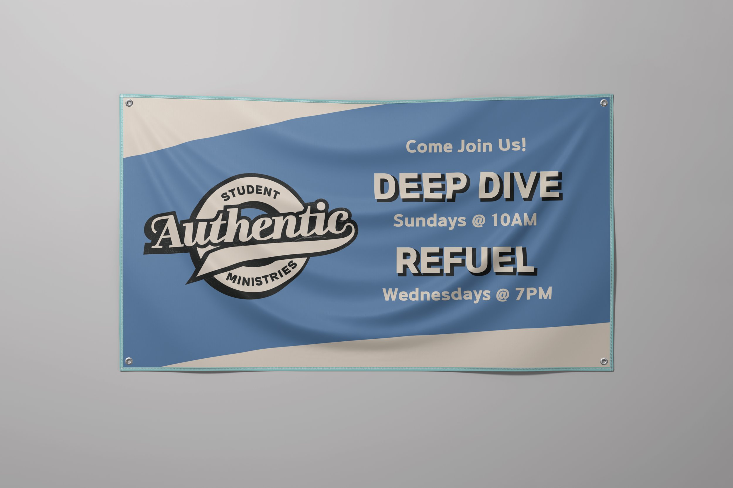
In 2024, the youth pastors at The Turning Point Church in Nashville, TN, approached me to design a new visual identity for Authentic Student Ministries, following a recent organizational restructuring. The rebrand aimed to overhaul the visual language of the youth group and to give it a more bold, vibrant, and youthful aesthetic to more effectively connect with a middle and high school audience. The new identity would include a full logo suite, color palette, and a handful of graphic elements. The identity would need to be scalable across social media, merchandise, and printed materials.
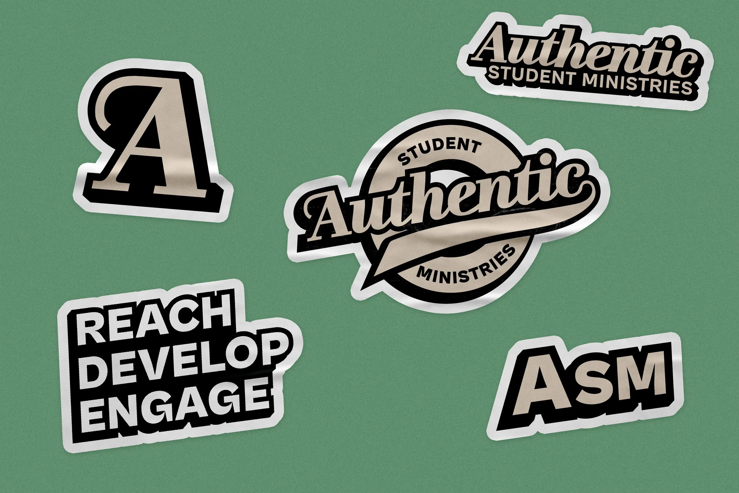
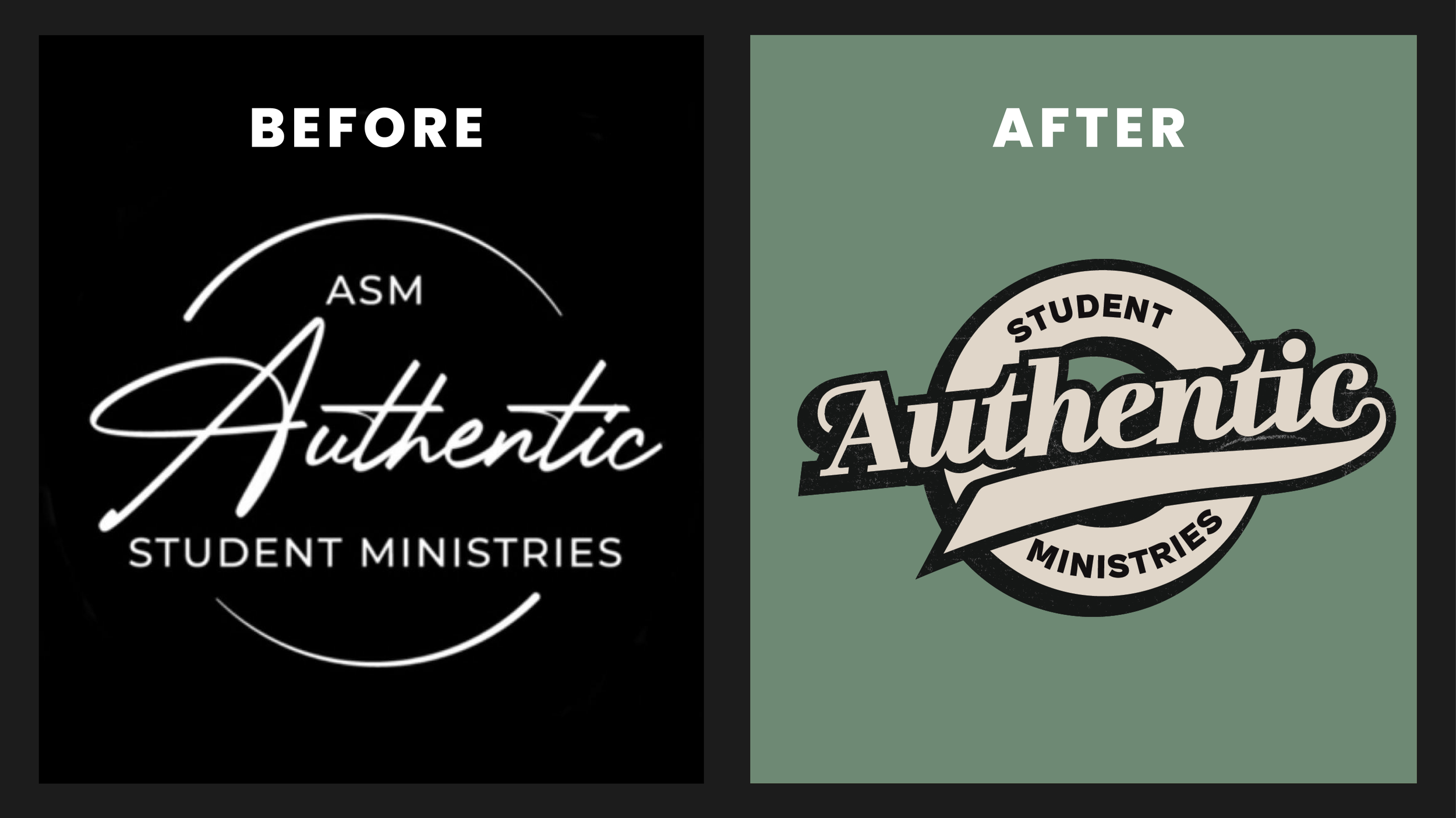
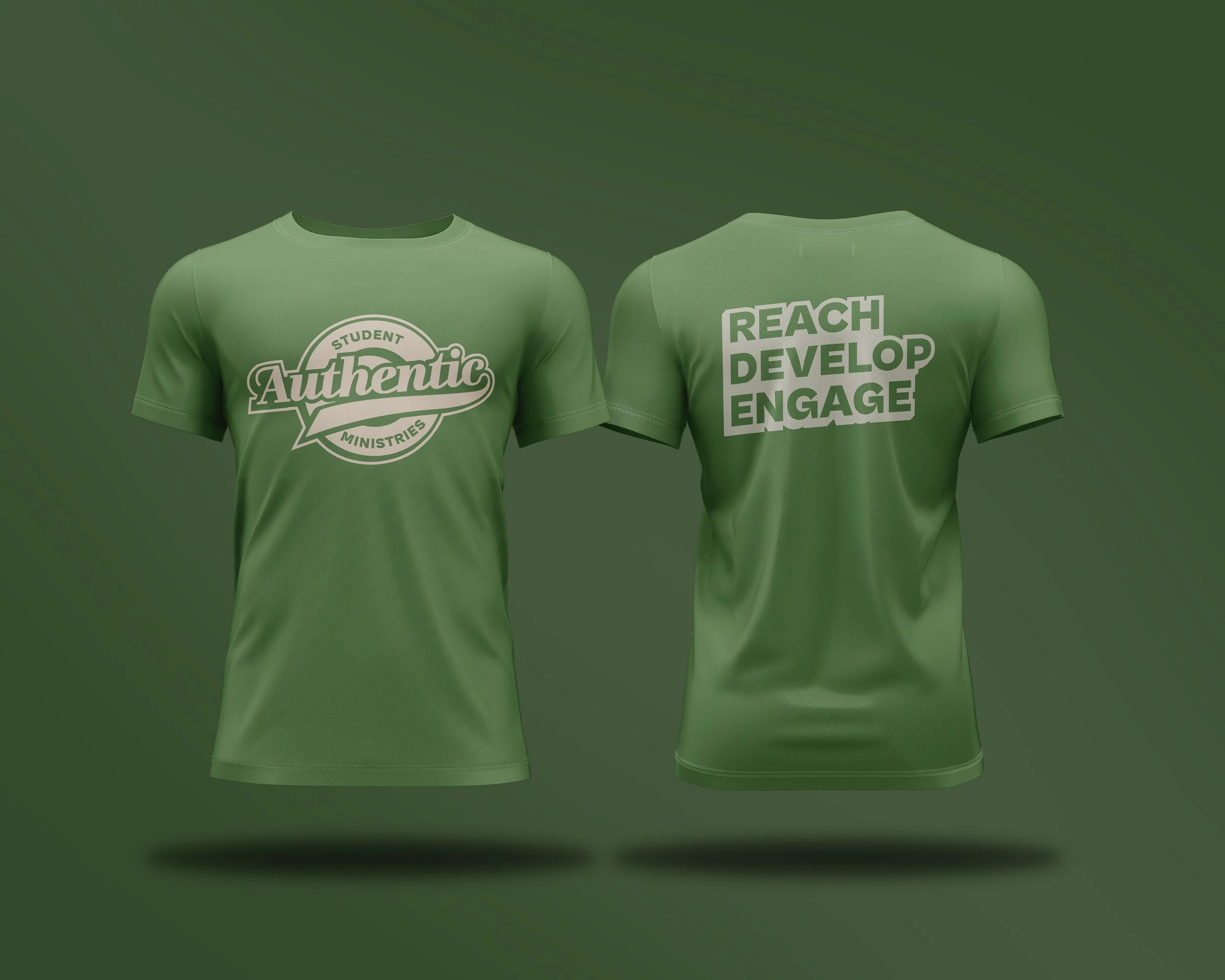
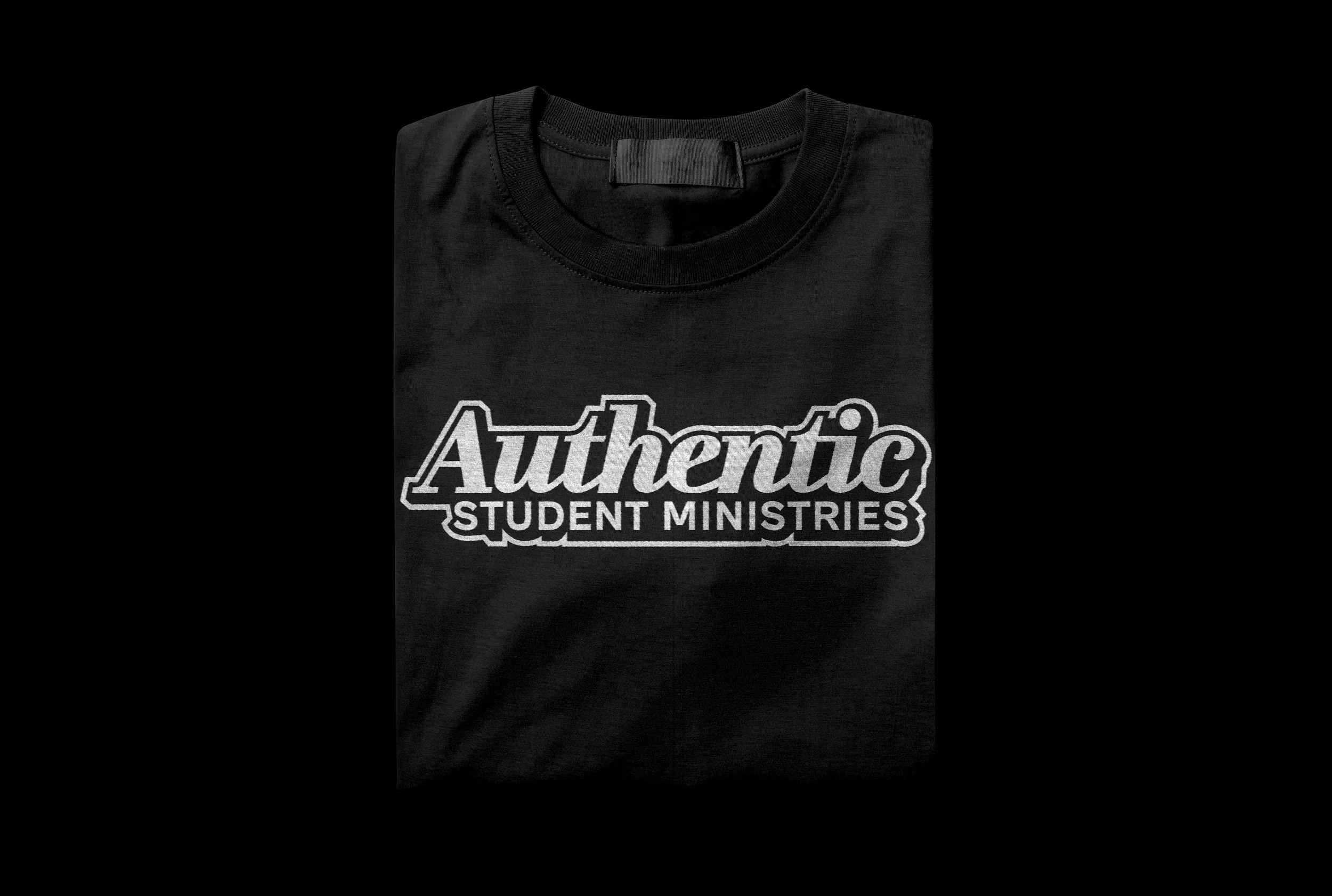
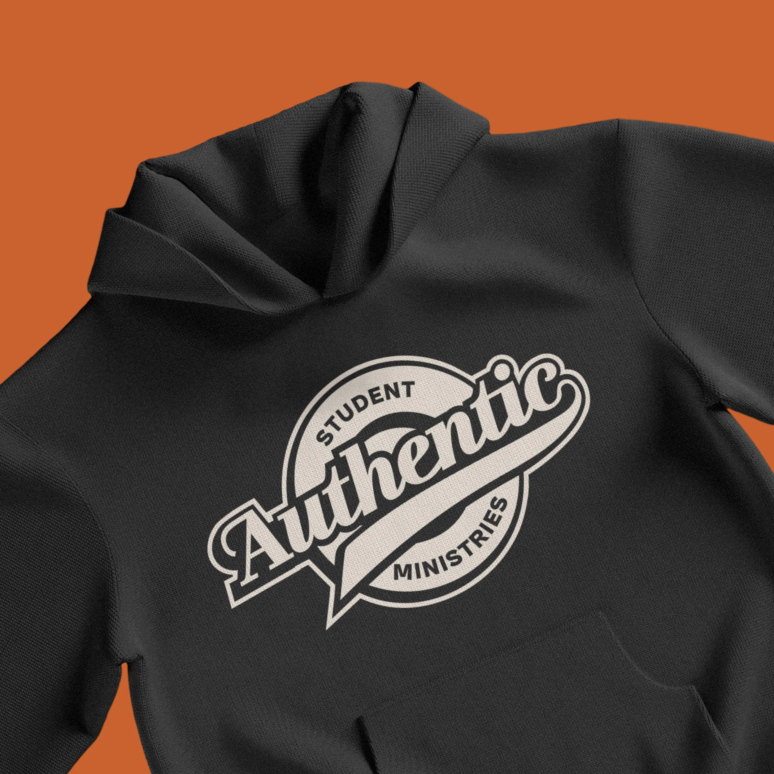
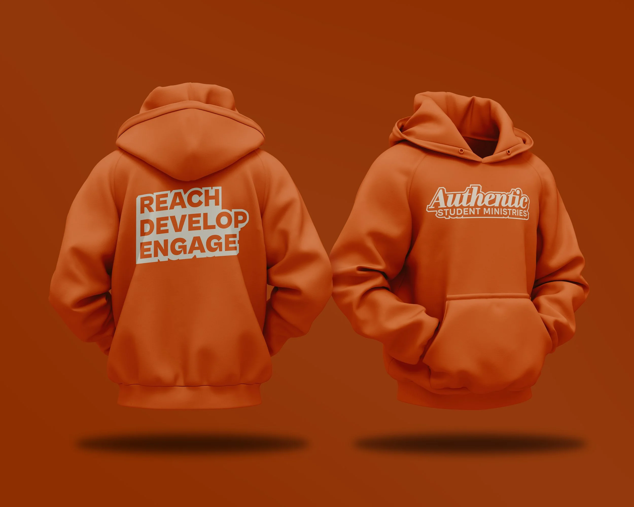
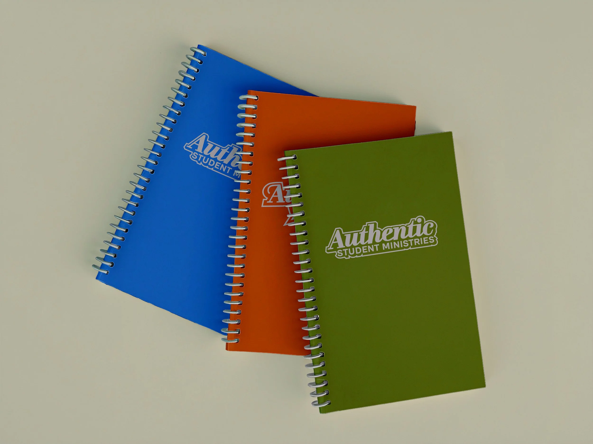
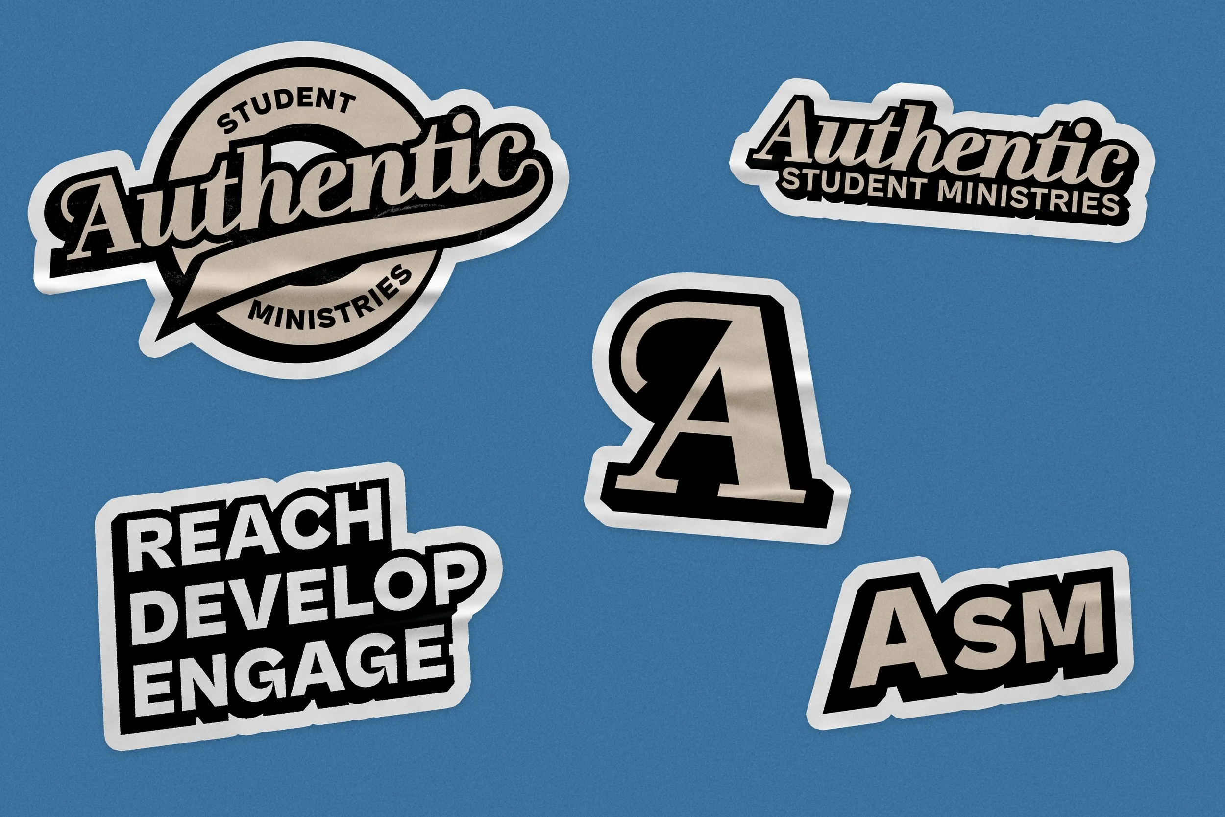
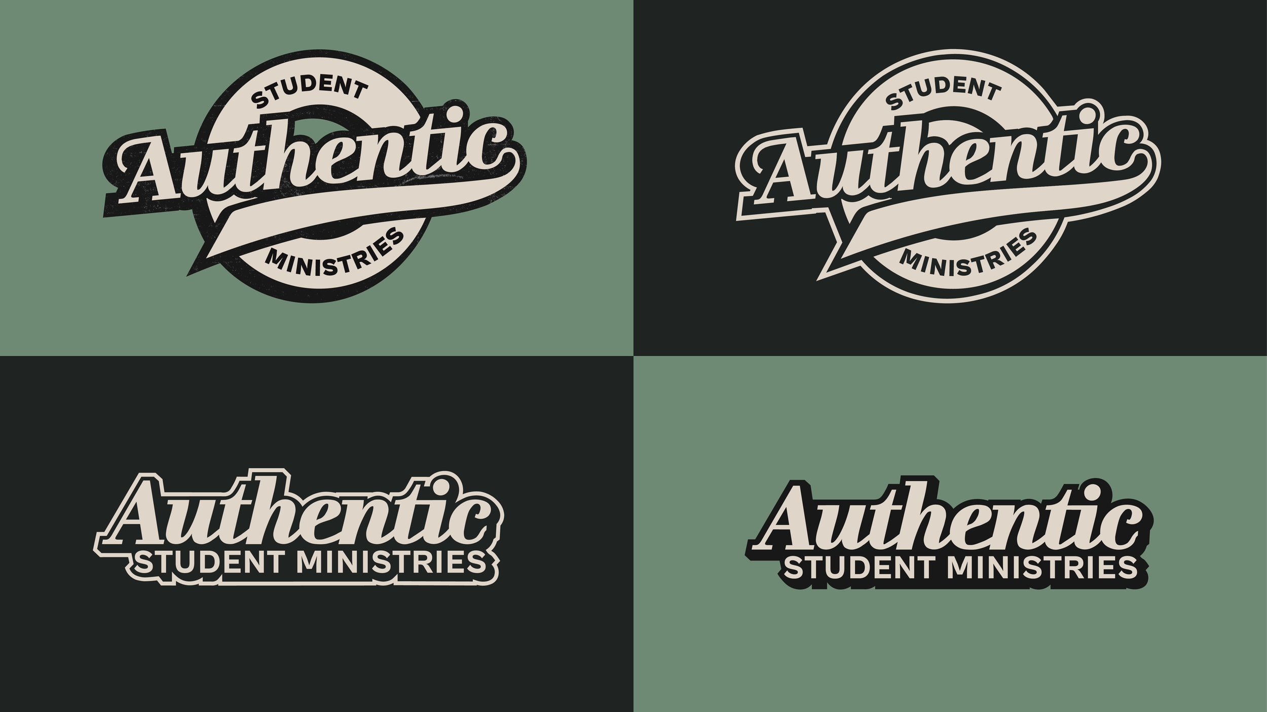
After researching youth group logos and identities from surrounding churches of similar faith, and establishing direction with the youth pastors, I first designed the primary logo loosely inspired by the appearance of an authenticity seal. A bold script font spells out “Authentic” with a long tail protruding from the “c” to give a playful feel. The script font is paired with a bold sans serif display font for the words “Student Ministries”. Four bold and playful colors were chosen, and a simplified secondary logo was designed alongside for tighter and more constrained use cases. Solid color versions of each logo were designed as well, primarily for use on merchandising to keep printing and production costs low. While not all proposed merchandise was produced, designs included T-shirts, hoodies, notebooks, hats, stickers, and pins.
The result is a cohesive brand that feels more playful, approachable, and catered toward an audience of pre-teens and teenagers.
LOGO SUITE
COLOR PALETTE

APPLICATION