
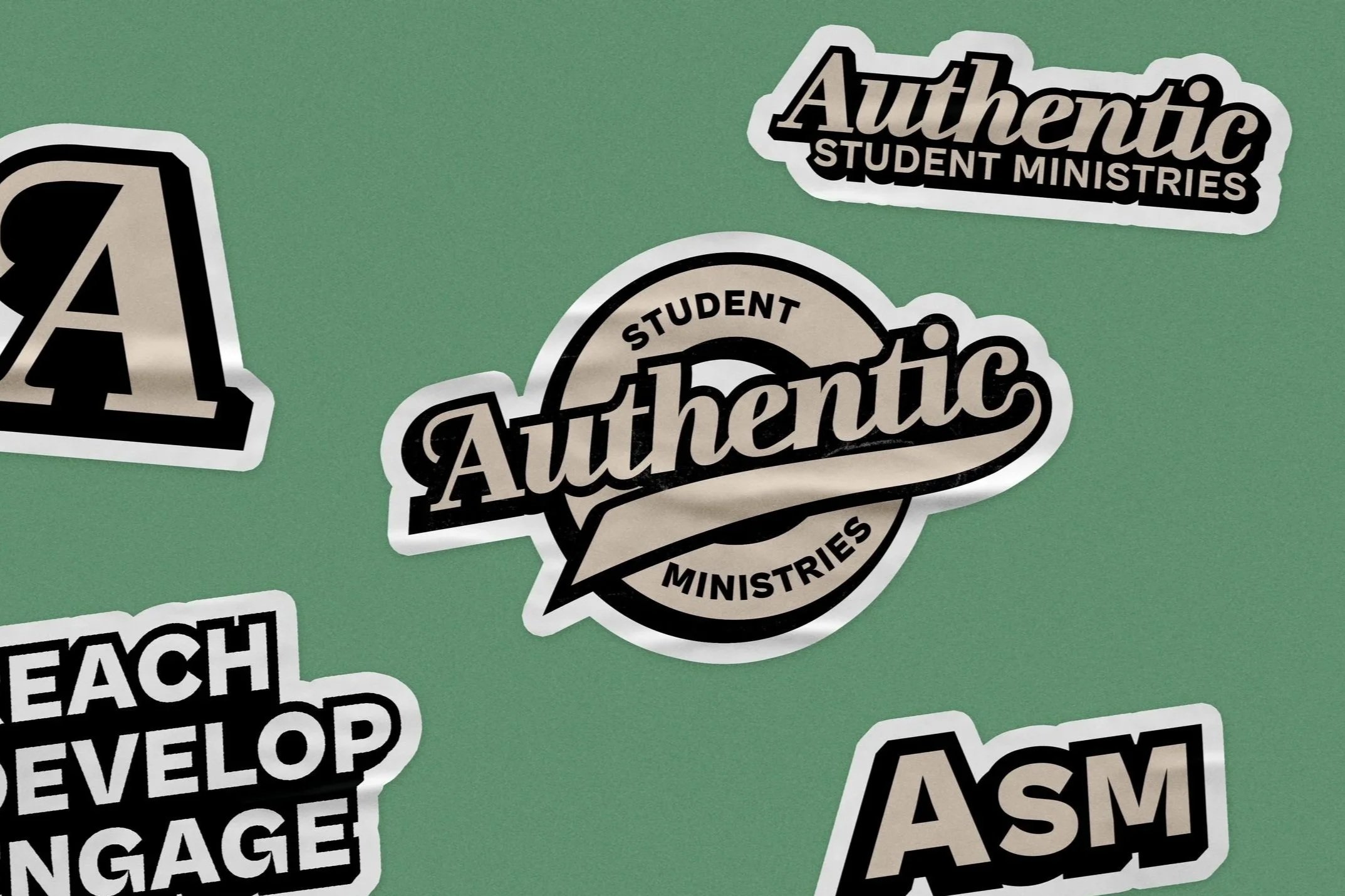
AUTHENTIC STUDENT MINISTRIES
Brand Identity • Logo Design • Social Media
Authentic Student Ministries is the youth ministry of The Turning Point Church in Nashville, Tennessee. Following an organizational restructuring in 2024, the ministry sought a complete visual rebrand that better reflected its renewed vision and connected more effectively with its younger audience.
The project included the development of a comprehensive visual identity system consisting of a primary and secondary logo suite, color palette, supporting graphic elements, and applications across print, merchandise, and digital platforms. The goal was to create a brand that felt energetic, approachable, and memorable while remaining flexible enough to grow alongside the ministry.
OVERVIEW
The Turning Point Church approached me to redesign the branding of Authentic Student Ministries after the youth department underwent a significant restructuring. While the ministry itself was evolving internally, its existing logo no longer reflected the energy, excitement, or personality the leadership wanted students to experience.
Working closely with the youth pastors, we established a creative direction centered around bold typography, vibrant color, and playful design. The new identity needed to embody the ministry’s name without feeling overly serious, while remaining versatile enough to work across social media, event promotions, apparel, signage, and future ministry resources.
THE CHALLENGE
My role was to create a visual identity that resonated with middle and high school students while remaining recognizable as part of The Turning Point Church.
The existing branding lacked a distinct personality and a cohesive visual system that could grow alongside the ministry. Rather than simply designing a new logo, the objective became creating an identity system that could unify everything from social media and sermon series graphics to apparel and promotional materials.
The branding also needed to balance feeling fun and approachable without becoming overly trendy. The final solution needed to be expressive, timeless, and practical across both digital and physical applications.
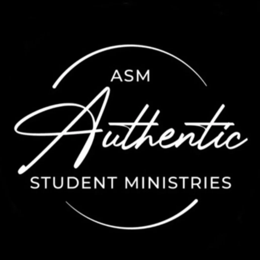
The previous logo for Authentic Student Ministries
RESEARCH & DEVELOPMENT
The project began with research into branding used by youth ministries from neighboring churches of similar size, denomination, and audience. This competitive review helped identify common visual trends while revealing opportunities to create something with a stronger personality and greater flexibility.
Inspiration was also drawn from the work of Bright Coal, whose branding systems for churches, youth ministries, and children's ministries effectively combine expressive typography, vibrant color, and simple graphic language into highly recognizable identities.
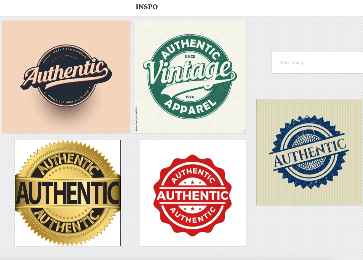
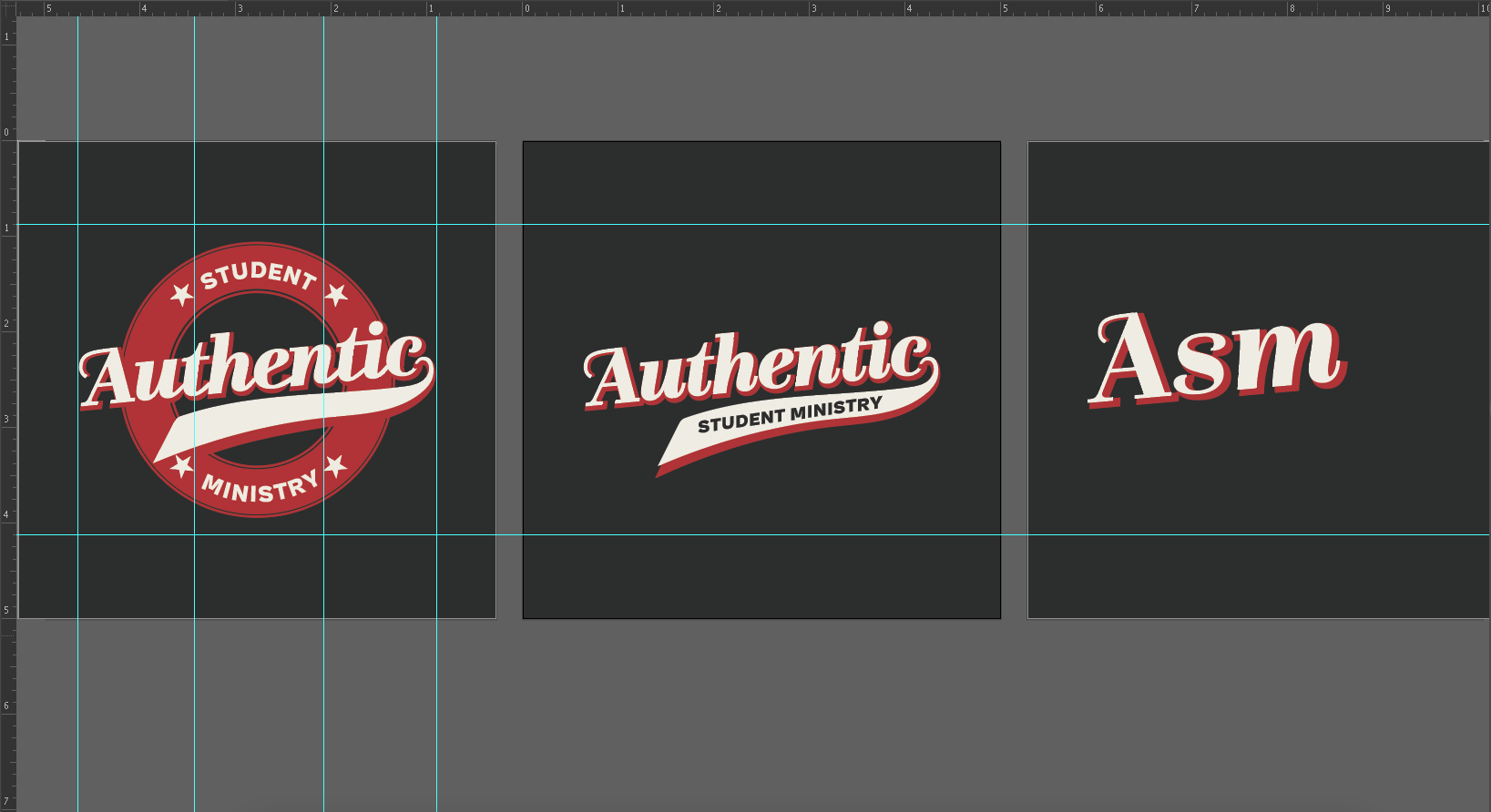
With a visual direction established, I explored a range of logo concepts through digital sketches, experimenting with typography and composition. The primary direction was inspired by the appearance of an authenticity seal, creating a subtle visual metaphor that reinforced the ministry's name while leaving room for a more expressive treatment.
This concept became the foundation for the broader identity system, influencing the use of bold shapes, layered typography, and playful supporting graphics across the final brand.
THE SOLUTION
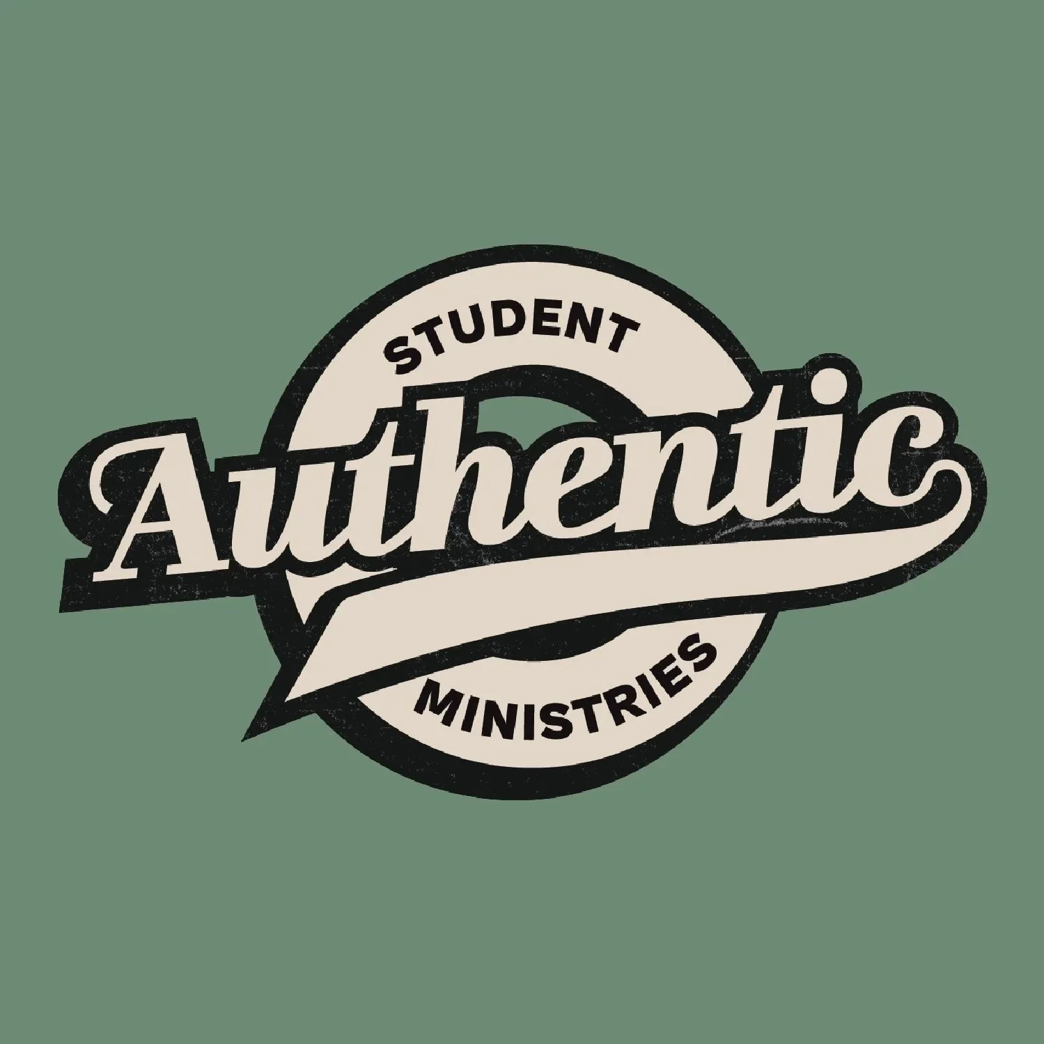
The final identity centers around a custom wordmark that combines expressive typography with clean, modern structure. A bold, angled script treatment gives the word "Authentic" movement and personality, while the extended tail of the final letter introduces a playful visual rhythm throughout the composition. This is paired with a bold sans serif display typeface for "Student Ministries," creating a clear hierarchy and strong legibility.
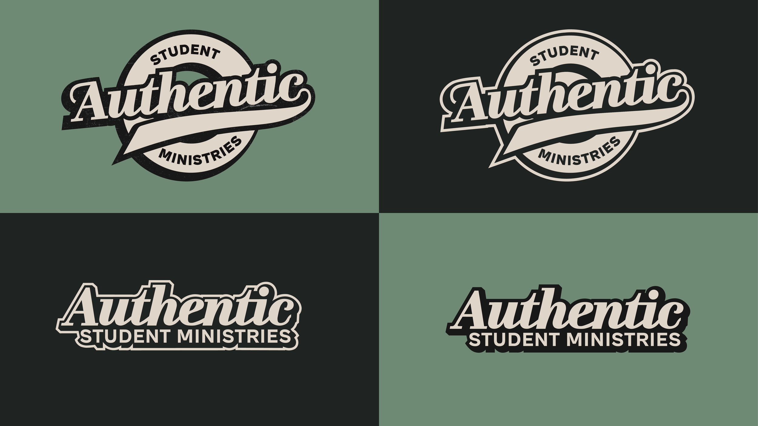
A vibrant four-color palette was selected to reinforce the ministry's youthful energy while providing flexibility for seasonal campaigns, events, and social content. Supporting graphic elements were developed alongside the logo system to create a consistent visual language that could be expanded as the ministry continued to grow.
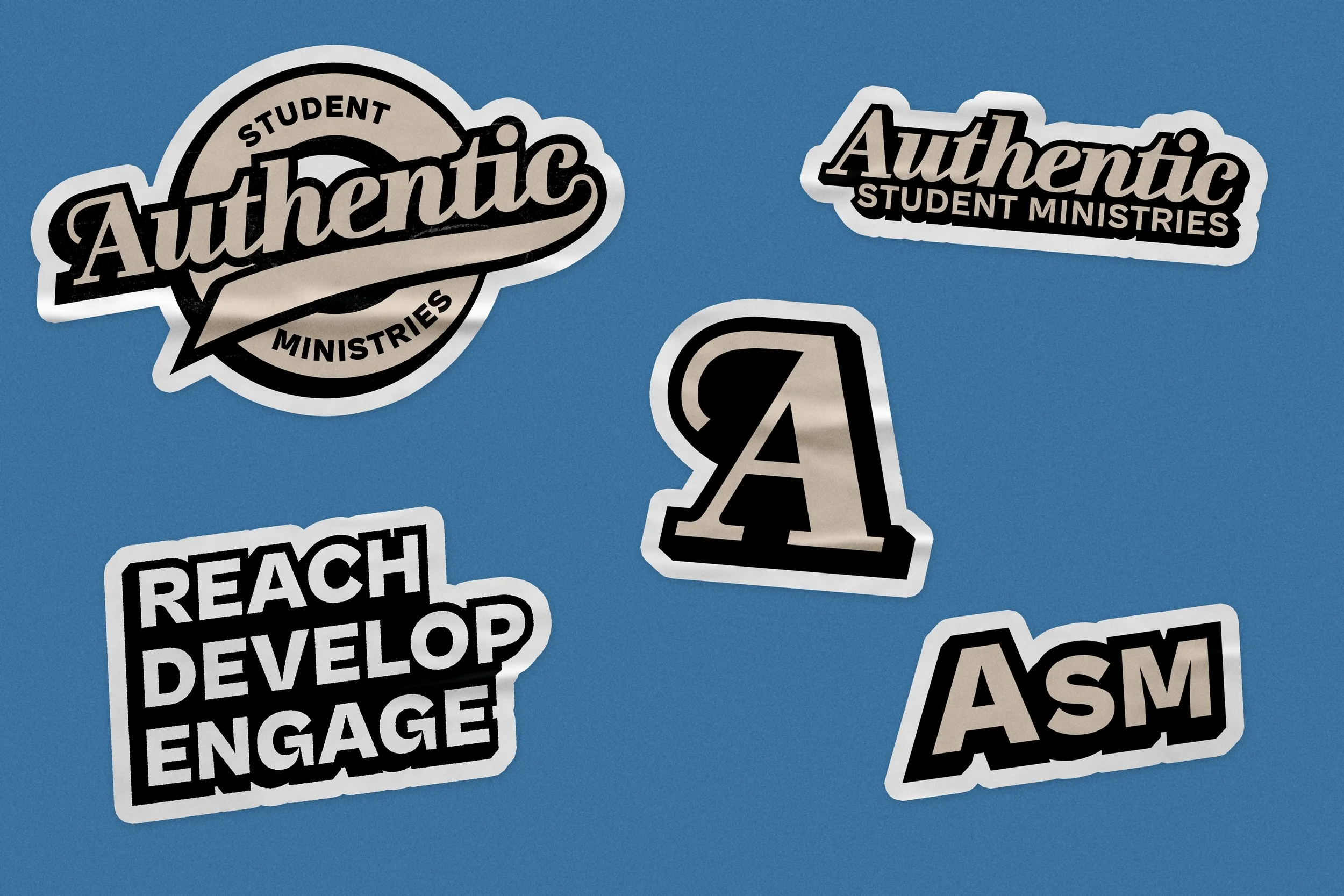
To improve usability, a simplified secondary logo and single-color versions were also created for situations where space, production methods, or budget required a more economical solution.

THE BRAND SYSTEM
The final identity was designed as a flexible brand system capable of adapting across a wide range of applications while maintaining a consistent visual presence. Alongside the logo suite, the system includes a vibrant color palette, supporting graphic elements, and simplified logo variations that allow the brand to scale seamlessly across both digital and physical media.
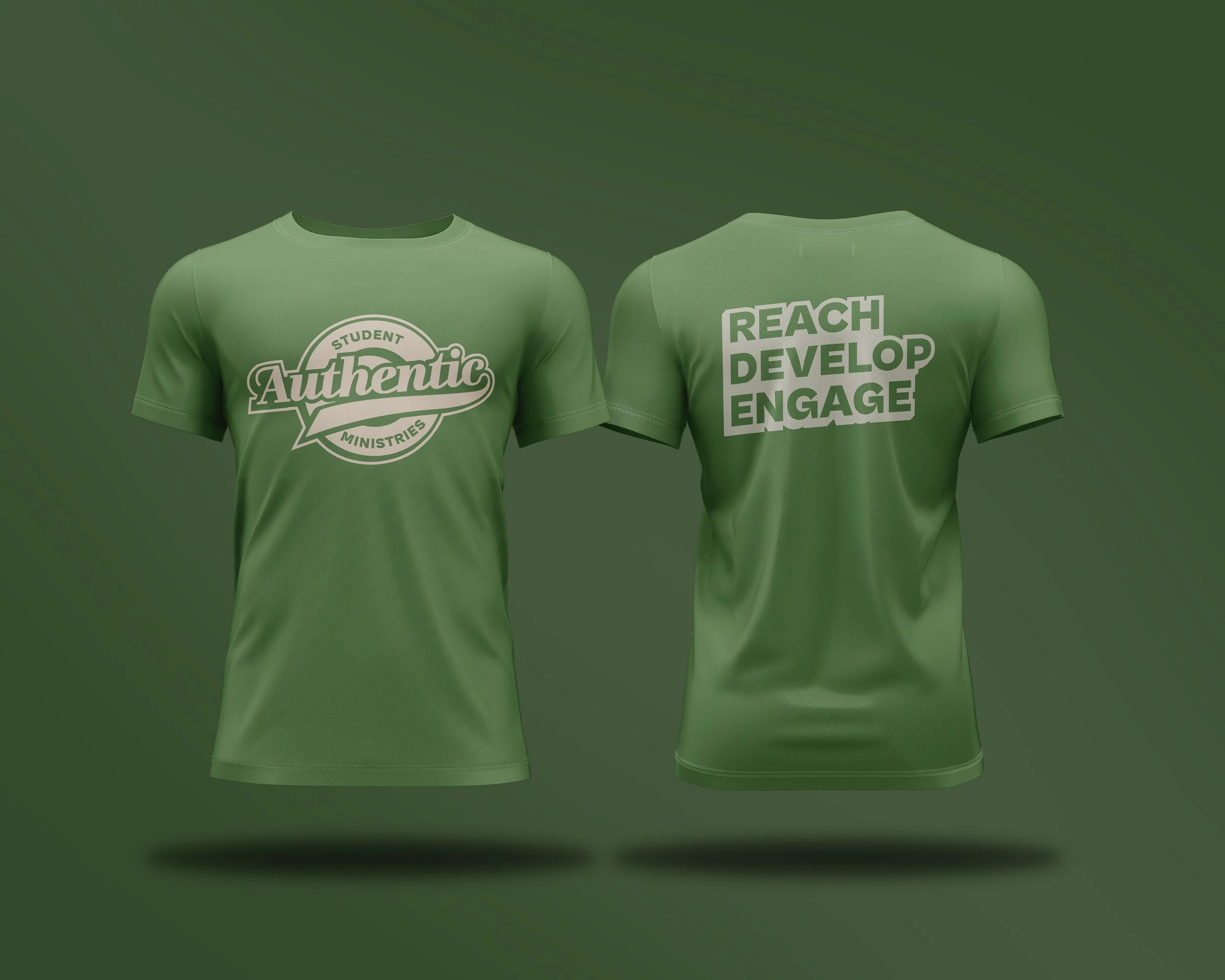
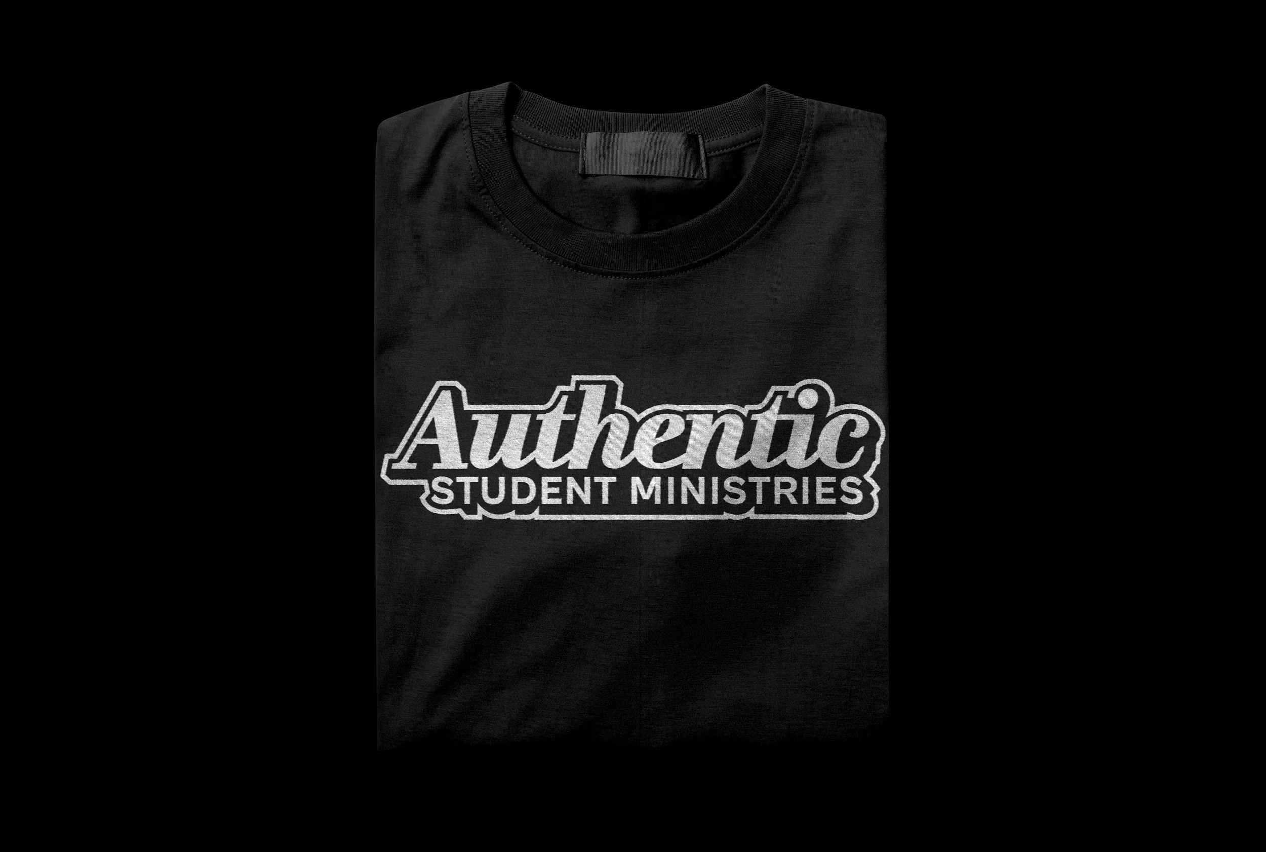
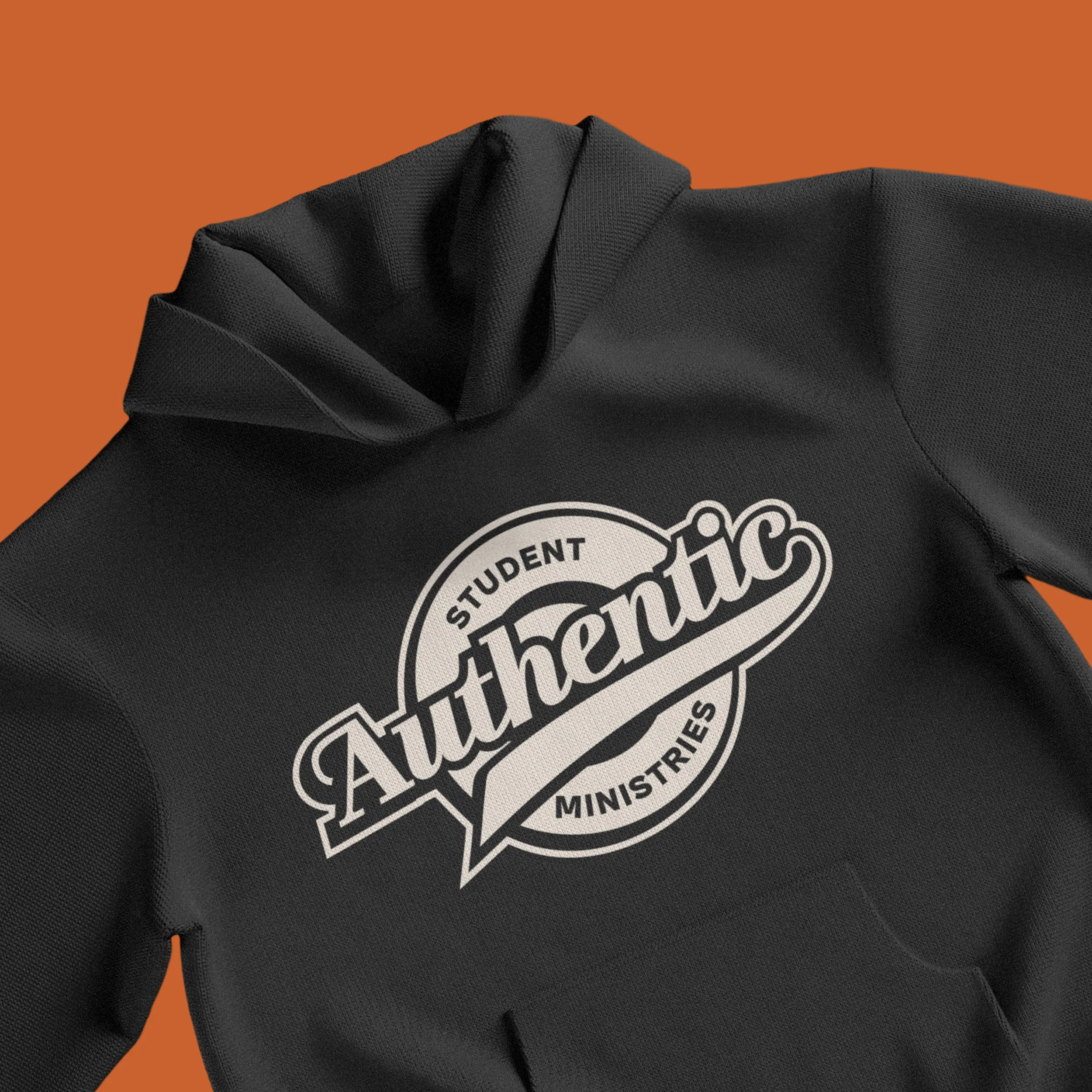
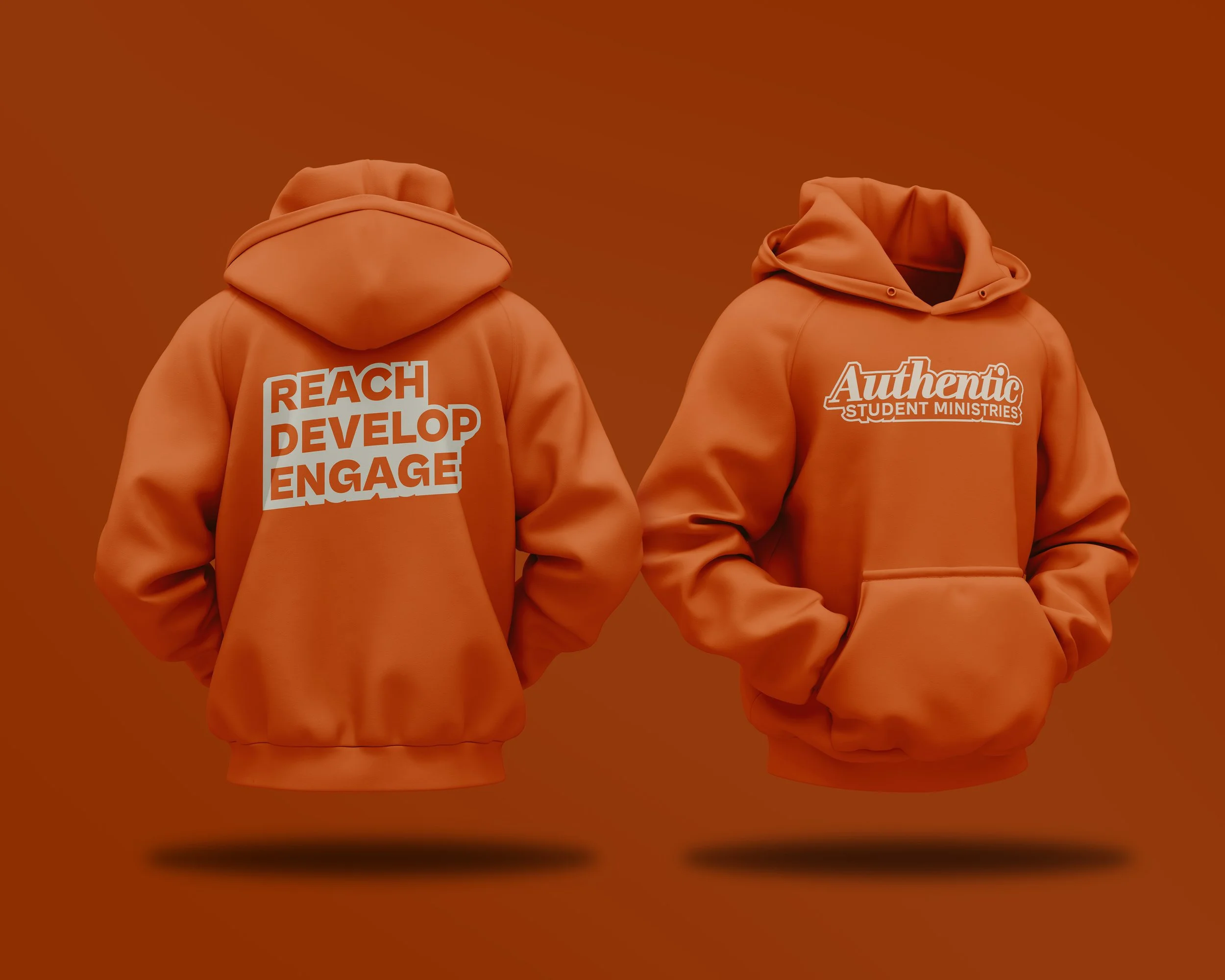
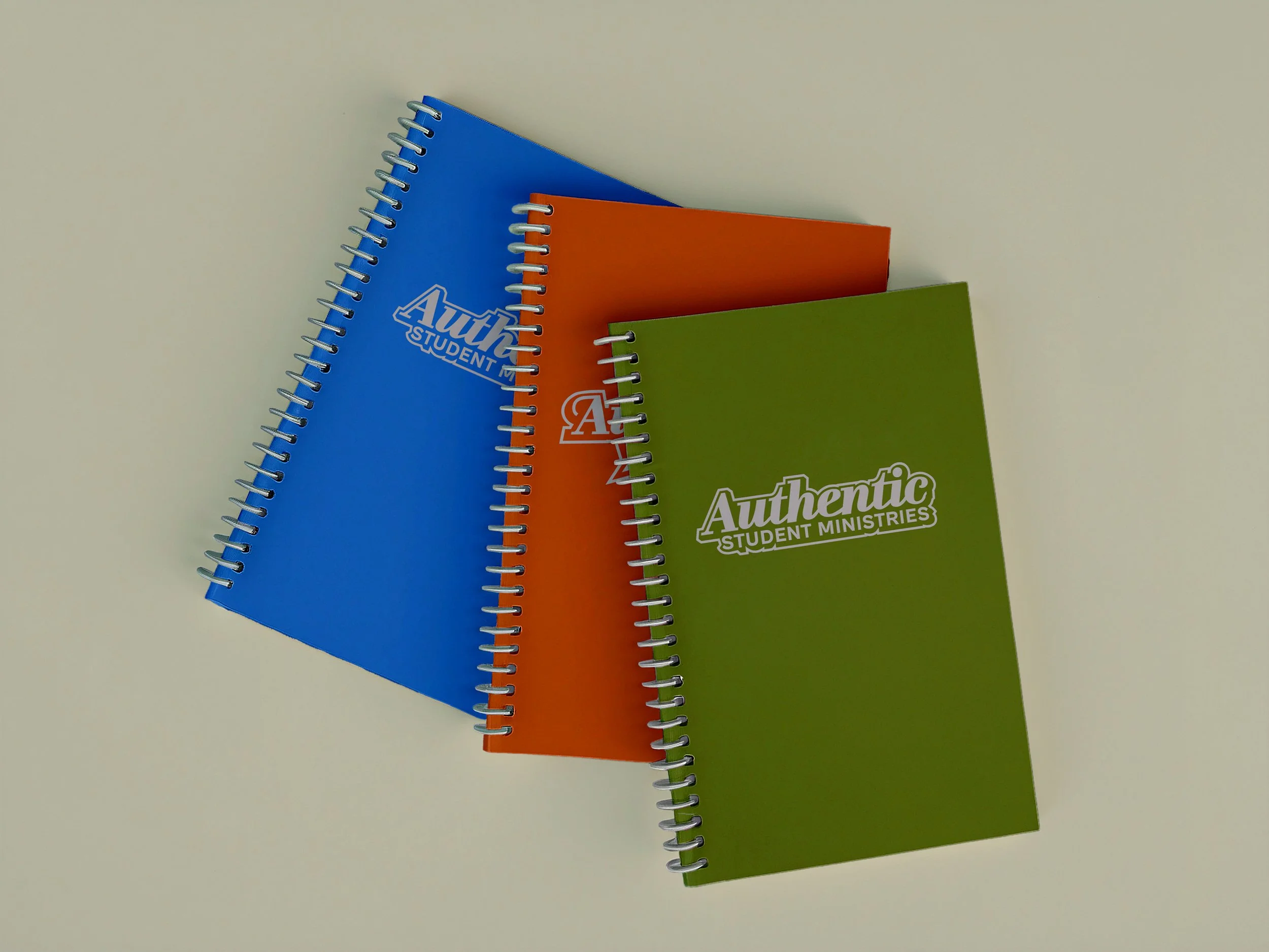
To demonstrate the system's versatility, the identity was applied to social media, print materials, and merchandise concepts including T-shirts, hoodies, hats, notebooks, stickers, and enamel pins. Together, these applications showcase a cohesive brand that feels bold, recognizable, and built for long-term growth.
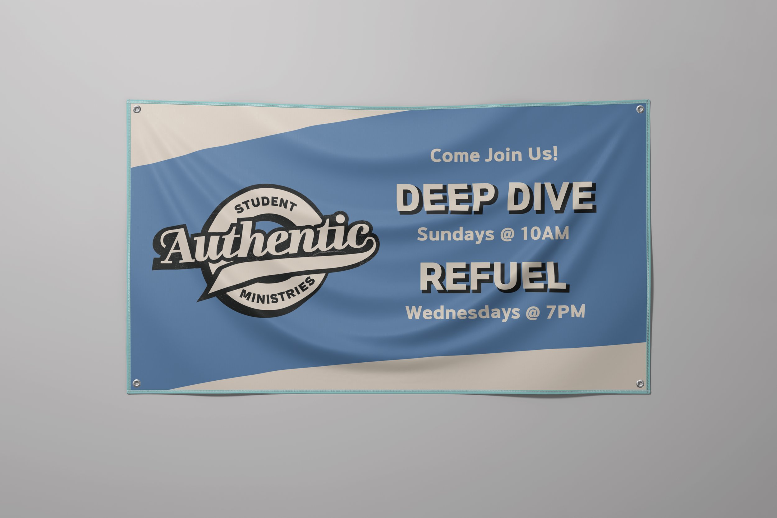
APPLICATION
The identity was designed to remain flexible across the ministry's most common touchpoints, from digital communications and event promotion to merchandise and printed materials. Each application uses the same core visual elements while adapting the system to different formats, audiences, and production requirements.



OUTCOME
The completed identity gave Authentic Student Ministries a cohesive and flexible visual system that could grow across events, social media, merchandise, and print. By balancing a bold, youthful aesthetic with a consistent underlying structure, the rebrand created a more recognizable and approachable presence for the ministry while providing a foundation for future communications.